Releases
- Fixed the Tailwind CSS import path when imported from the root package folder
There were a lot of questions about if it's possible and if it's a good idea to use Tailwind CSS together with Reshaped. We've always thought that it's a great idea and lets our users use css utilities when they need to get outside the Reshaped scope and build something custom.
Today, we're making it much easier to do this. Starting with v1.14, you can import a theme config for Tailwind CSS right from our package and get access to the same design tokens you had access in your CSS.
const { getTheme } = require("reshaped/tailwind");

module.exports = {
  ...
  theme: getTheme(),
}
What makes it special is that you won't need the dark: variant to implement the dark mode. All colors resolve automatically, same as when you're using our components.
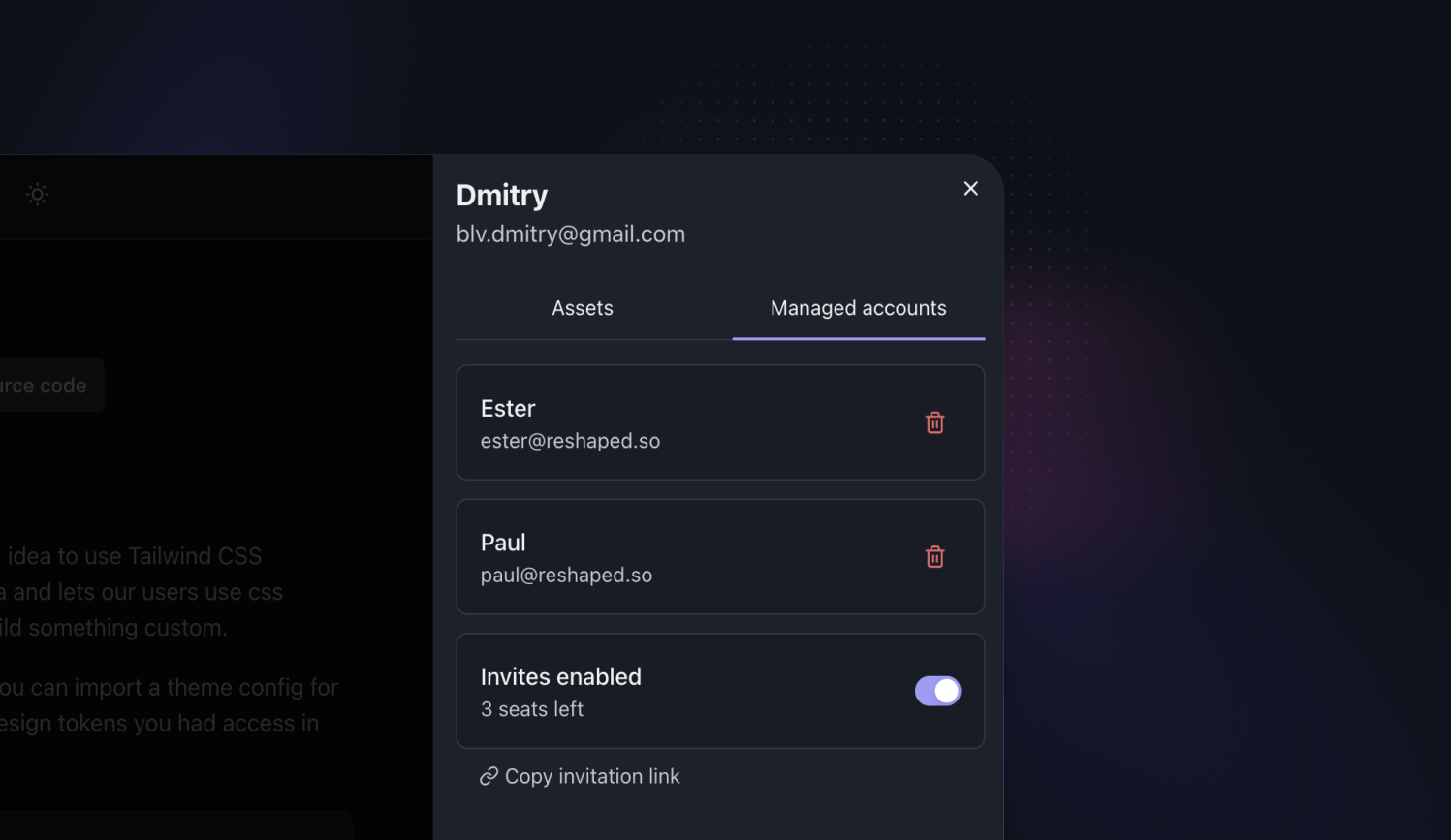
If you purchase multiple seats for your license, you can now let others create individual accounts with their own credentials attached to your Reshaped license. As an admin, you can choose when invites are enabled for the license, see everyone using the license and remove their access if needed.
We're getting closer to the v2.0 alpha build with Figma library moving to the test phase. All the components have been reviewed and updated from the ground up to work better with auto layout edge cases, support better composition and use the most out of the component properties.
We now start to work on the React implementation of the same change and you can expect a beta version ship for both design and code in May. At that point we'll be waiting for the Figma Config announcements before we release a stable 2.0 release.
- Fixed empty space in bordered tabs, when scrollbars are enabled in the system
- Fixed an edge cases with scrolling added to the tabs with equal width items
- Fixed access to the theming CLI
- Fixed insetBottom styles applied incorrectly
- Added support for the divided property used together with the column layout
Documentation:
- Added documentation for working with the system color mode
- Added documentation for the Tokens Studio integration
Other:
- Moved away from the exports field in package.json to keep support for all bundlers and frameworks
We've added a new hook that supports the same responsive syntax as other components do for layout styles. It uses the matchMedia browser API to resolve the value of the currently used viewport size.
Since we browser viewport size is available only on the client-side, we're also providing a way to pick a default fallback value during the server-side rendering. It can be used either for the most used viewport size or together with user-agent detection.
function Example() {
  const backgroundColor = useResponsiveClientValue({
    s: "neutral",
    l: "primary",
  });

  return (
    <View
      backgroundColor={backgroundColor}
      height={10}
      width={10}
      borderRadius="medium"
    />
  );
}
To reduce the amount of nested components and solve edge cases of using AspectRatio``, we've exposed the aspectRatioprop directly onView. Alongside with that, we're deprecating the AspectRatio` utility. It's staying in the package for now and will be removed in the next major release.
<View
  backgroundColor="neutral-faded"
  aspectRatio={16 / 9}
  width="200px"
  borderRadius="medium"
/>
- Fixed and improved its internal handler storage logic for cases when multiple hotkeys are used on the same page
- Added support for switching between themes with a useTheme hook when Reshaped provider is using defaultTheme property
Framework and bundlers integrations
- Fixed type definitions for the cases when Reshaped is imported as a pre-build webpack bundle
- Added postcss support to the Remix starter
- Fixed errors when using Reshaped components from Next 13 app directory server components
We've added a new useHotkeys hook for handling application shortcuts and general keyboard interaction. Since we already have Reshaped provider for working with the global application state, we use it to optimize event handling.
We handle a lot of small edge cases regarding how keyboard events work and how pressed keys combination are handled natively, so we recommend using this hook every time you want to add keyboard navigation to your components or product features.
function Example() {
	const { checkHotkeyState } = useHotkeys({
		"shift + b + n": null,
	});
	const active = checkHotkeyState("shift + b + n");
	const shiftActive = checkHotkeyState("shift");
	const bActive = checkHotkeyState("b");
	const nActive = checkHotkeyState("n");

  return (
		<View
			animated
			gap={2}
			direction="row"
			backgroundColor={active ? "positive-faded" : undefined}
			padding={2}
			borderRadius="small"
		>
			<View
				paddingInline={4}
				paddingBlock={2}
				borderRadius="small"
				borderColor="neutral-faded"
				animated
				backgroundColor={shiftActive ? "neutral-faded": "base"}
				shadow={shiftActive ? undefined : "base"}
			>
				Shift
			</View>
			<View
				paddingInline={4}
				paddingBlock={2}
				borderRadius="small"
				borderColor="neutral-faded"
				animated
				backgroundColor={bActive ? "neutral-faded" : "base"}
				shadow={bActive ? undefined : "base"}
			>
				b
			</View>
			<View
				paddingInline={4}
				paddingBlock={2}
				borderRadius="small"
				borderColor="neutral-faded"
				animated
				backgroundColor={nActive ? "neutral-faded" : "base"}
				shadow={nActive ? undefined : "base"}
			>
				n
			</View>
		</View>
  );
}
With the new direction property you can now decide to stack tab items vertically. It works great when you want to switch page content and display menu items in a sidebar.
<Tabs direction="column">
  <View width="150px">
    <Tabs.List>
      <Tabs.Item value="1" icon={ActivityIcon}>
        Item 1
      </Tabs.Item>
      <Tabs.Item value="2" icon={ActivityIcon}>
        Long item 2
      </Tabs.Item>
      <Tabs.Item value="3" icon={ActivityIcon}>
        Very long item 3
      </Tabs.Item>
    </Tabs.List>
  </View>
</Tabs>
- Added elevated property for action bars rendered above the page content
- [Figma] Updated auto layout for all variants to use fixed width
- Added displayStyle property to change the display css value that is applied to the component when it's visible
- Added a new headless variant that removes most of the styles from the Popover.Content
- Added support for adding non-interactive elements inside the Tabs.List
- Updated to use relative position by default
Figma:
- Added base reverse and elevated reverse shadow tokens to support shadow display on the top side of the elements
- Added slot utilities for easier layout composition. Check more about it in our new Figma core concepts documentation page
- Updated variants layout for the most of the components using the PropStar plugin
Documentation:
- Added documentation for the recently released CSS modules support in Remix, which now allows you to use our ESM build
- Added documentation about a few Figma core concepts we use when building Reshaped components
- Updated Dismissible utility documentation with an interactive example
We've shipped a new Timeline component for displaying lists of data in chronological order. It's built using compound components in code and consists of composable items in Figma, to let you easily build and maintain them in your product.
<View width="400px" maxWidth="100%">
  <Timeline>
    <View backgroundColor="neutral-faded" height={10} />
    <View backgroundColor="neutral-faded" height={10} />
  </Timeline>
</View>
We've added dynamic resolving for different types of properties setting width and height of the elements. Before this release, you could see that some of the component properties, like padding or gap were using values as unit design tokens. For example, padding={4} would resolve to 16px in the default theme. width and height properties were outliers working with literal values, in order to support values like 100% or 50vh.
In this release we're adding number support for the properties defining the size of an element. It means that you can use still use it as before, but you can also pass a number value to automatically resolve it to a unit design token. This is especially helpful for smaller elements, where you wouldn't want to hardcode a specific px value.
This approach still works with the responsive syntax and it lets you use unit values for one viewport and literal values for another.
<View
  height={25}
  width={{ s: "100%", l: 25 }}
  backgroundColor="neutral-faded"
/>
View received support for working with its positioning without writing custom CSS. We've added new position and zIndex properties to handle how components are rendered relatively to each other, as well as a set of inset properties to control their coordinates.
Inset is the name of the vanilla CSS property when working with logical CSS properties, that helps you work with positioning for both LTR and RTL languages
<View
  position="relative"
  backgroundColor="neutral-faded"
  height="100px"
  borderRadius="medium"
>
  <View position="absolute" insetTop={2} insetEnd={2}>
    <Button icon={IconHeart} />
  </View>
</View>
- Optimised styles by removing custom responsive size implementation
- [Figma] Auto layout fixed when used with instance swapping
- Added number values support for width
- Added literal values support for size
- Added support for using icons directly inside AspectRatio
- [Figma] Auto layout fixed when used with instance swapping
- Added number values support for width and height
- Added number values support for width and height
- Added responsive syntax support for borderRadius
- Added number values support for height, width, maxHeight and maxWidth
Website
- Split View properties documentation into separate groups
- Added an interactive playground for the flex properties
Source code
- Added a test setup for the newly added internal style utilities
- Updated the package structure to use exports field in package.json and reduce the noise in the repository after building the project
We've shipped a new Skeleton component for displaying animated content placeholder while data is still loading. It's built to be easily composed with other components and achieve layouts of any complexity. Additionally, its documentation comes with multiple examples of how skeletons can be used in the products.
<View width="400px" maxWidth="100%">
  <Card padding={0}>
    <View aspectRatio={16 / 9}>
      <Skeleton borderRadius="none" />
    </View>
    <View padding={4} gap={2}>
      <Text variant="body-strong-1">
        <Skeleton width="40%" />
      </Text>
      <Skeleton />
      <Skeleton height="36px" width="120px" />
    </View>
  </Card>
</View>
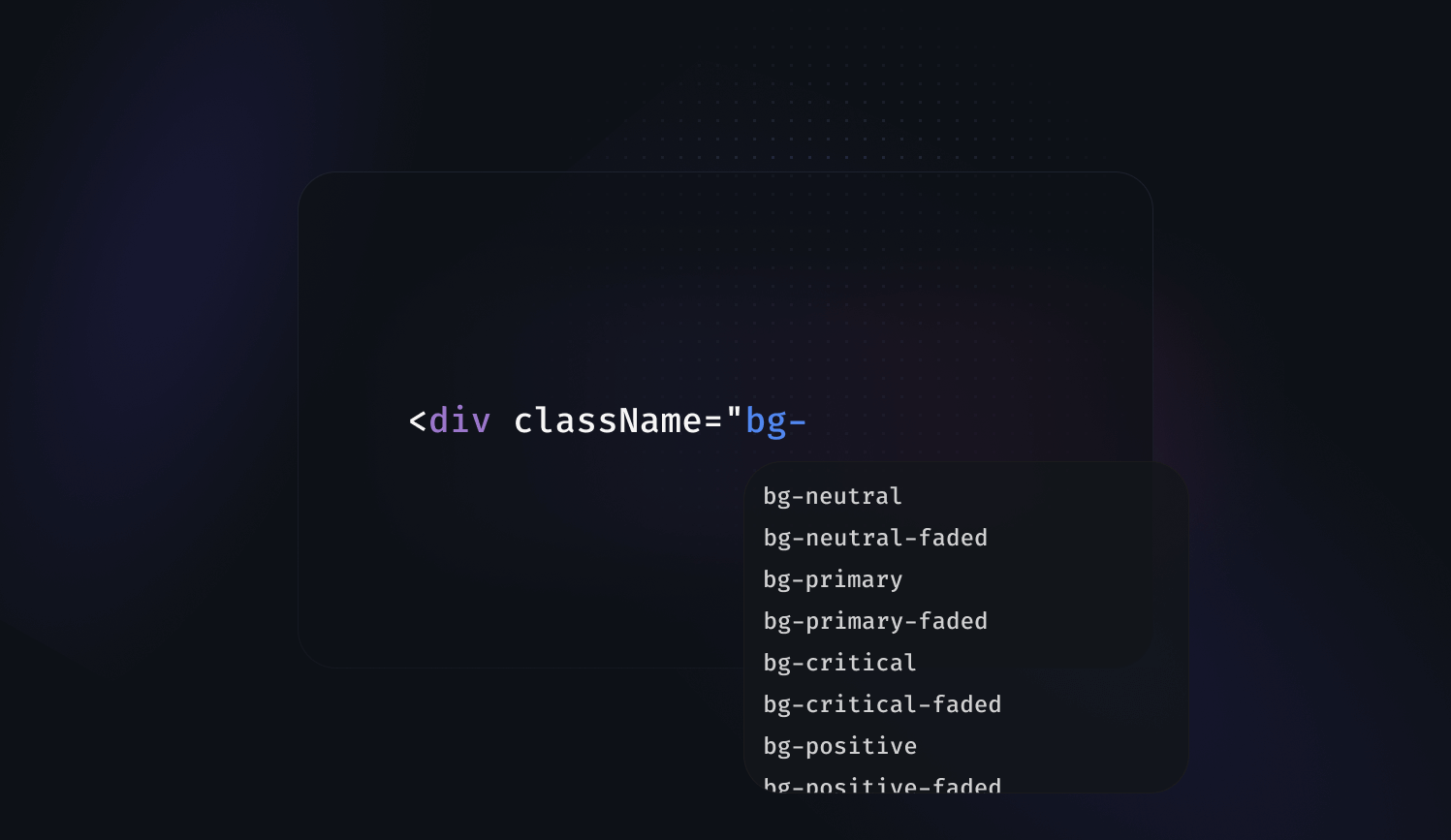
Reshaped semantic tokens are aiming to provide a limited number of tokens that should cover most of the use cases for building interfaces. However, there will always be edge cases where semantic tokens might feel limiting. For example, imagine you're building a chart component. You need a few custom colors for it but you also want to make sure they support dark mode the same way all Reshaped components do.
To address this, we've added support for adding custom design tokens to the theme definitions:
const config = {
  themes: {
    productTheme: {
      color: {
        foregroundNeutral: { hex: "#1a1a1a", hexDark: "#fff" },
        chartTomato: { hex: "#ff6347", hexDark: "#b8412c" }
      },
    },
  },
}
- Fixed active accordion seeting height on mount
- Fixed responsive padding property not applying correctly
- Added circular radius support
- Added disabled and disabled faded background color support
<View width="340px" maxWidth="100%" direction="row" gap={4}>
  <View.Item grow>
    <TextField size="large" placeholder="Enter your e-mail" />
  </View.Item>
  <Button color="primary" size="large">Subscribe</Button>
</View>
TextField, TextArea and Select components now support large and xlarge sizes and Button component has also received supported for xlarge size. With these additional values, you're now more flexible when building landing pages or other marketing material without overriding any of the components styles.
All these properties support responsive syntax, which means you can change these components sizes based on the device viewport.
- Started reusing more internal styles across the components, which has reduced the overall bundle size of the library
- Figma: Moved elevated variant to a boolean property
- Added large size support to use together with the new form fields sizes
- Updated error state to match the field border width
- Updated focus state to take less space inside the field
- Figma: Moved show label variant to a boolean property
- Updated error state to match the field border width
- Updated focus state to take less space inside the field
- Figma: Moved show label variant to a boolean property
- Updated error state to match the field border width
- Updated focus state to take less space inside the field
- Aligned start and end slots horizontal and vertical padding
- Figma: Moved show label variant to a boolean property
- Aligned icon position across all color variants
- Updated bleed property to correctly restore border radius when disabled based on the viewport
We've shipped a new Accordion utility for toggling visibility of the content areas with automatic support of its height animation. It supports any type as content as well as it lets you use any component as a trigger.
<View height="120px" width="300px" maxWidth="100%">
  <Accordion>
    <Accordion.Trigger>
      <View backgroundColor="neutral-faded" height={10} />
    </Accordion.Trigger>
    <Accordion.Content>
      <View paddingTop={4}>
        <View backgroundColor="neutral-faded" height={10} />
      </View>
    </Accordion.Content>
  </Accordion>
</View>
Components documentation have received an update with updated demo sections. Instead of showing static examples of how components look like, documentation now includes interactive knobs for trying out different combination of component properties values. That should help you see how component behaves without reading the whole article.
Check out the components documentation to see it in action. For example, you can start with a Button component as an example of component with many different visual properties.
With the v13 being released now, Next.js supports a new way to build routes with the app directory. One of the changes relevant for UI development that happened there was introduction of global css imports support inside node_modules folder. That means that Reshaped now works with Next without any webpack config customisations or additional plugins.
In this release, we've added a few improvements to align with the changes introduced in the latest Next.js major and have published a new starter example for Next.js 13, as well as we have updated its integration docs.
- Overlay: Added a new transparent flag to hide the background and make the content behind it interactable
- Badge: Fixed z-index of the badge when used with Badge.Container content that already has its own z-index defined
- Breadcrumbs: Limited minimum amount of defaultVisibleItems to 2 items
- MenuItem: Fixed the combination of disabled and selected state hover effects
- Modal: Added a new transparentOverlay property
- Popover: Updated position calculations for the cases when it's rendered in a fixed position element on the page
- Popover: Added ref to the attributes to automatically inherit the trigger element styles
- Tabs: Fixed tabs container width for the cases when it was not taking full size of the parent
- Tabs: Fixed icon gap when using Tab.Item without any text content
- TextField: Added small vertical padding for start and end slots
- Toast: Updated z-index to be displayed on top of the Overlay and its content
- View: Added support for individual padding properties, including responsive syntax support: paddingTop, paddingStart, paddingEnd and paddingBottom
- Focus trapping: When releasing the focus, we now prevent the page from scrolling for mouse users if the focus target is outside the viewport
<View width="200px" maxWidth="100%" gap={2}>
  <View direction="row" gap={2} align="center">
    <View
      width="32px"
      height="32px"
      borderRadius="medium"
      backgroundColor="primary"
    />
    <View.Item grow>
      <View height="12px" backgroundColor="neutral" borderRadius="medium" />
    </View.Item>
  </View>
  <View direction="row" gap={2} align="center">
    <View
      width="32px"
      height="32px"
      borderRadius="medium"
      backgroundColor="primary"
    />
    <View.Item grow>
      <View height="12px" backgroundColor="neutral" borderRadius="medium" />
    </View.Item>
  </View>
</View>
Looking at the different ways of how Stack and Frame utilities can be used, we have noticed that in many cases both of them are used together. Stack is solving the layout challenges, while Frame allows us to easily access design tokens for typical styles. Additionaly, they both have overlaps in terms of what they provide from the flex api.
To avoid producing more markup than needed and simplify the structure of the codebases using Reshaped, we are introducing a new utility, called View. It supports functionality from both Stack and Frame, and provides more flexibility for how its properties can be combined, including full responsive syntax support for its layout properties. Additionally, we've madded some improvements to the View API:
- View.Item supports a gapBefore property, which is called gap in Stack.Item
- View.Item supports a columns property, which is called size in Stack.Item
- gapBefore now respects View.Item columns property, keeping multi-column layout predictable
- backgroundColor now supports black value, that stays black in light and dark mode
Being the most low-level utility component, View is probaly going to be the most used component in your interfaces when using Reshaped. You can find information about the View API on its documentation page.
Stack and Frame utilities are still available in the library and are now using View under the hood. They're going to be dropped in the next major release.
We are on a path to make our documentation even more interactive and contextual. With this release, we have revamped structure of all our component pages:
- We've split content into two tabs, providing a quick access to the properties table for every component
- For ActionBar we've created another tab called Examples, showcasing different composition approaches for the component. We plan to do the same for all other components once we see how well ActionBar examples work for our users.
- Each component now has a card with meta information, that previously was a part of the content and a link to its Storybook files, providing access to even more advanced examples and edge cases.
- All Storybook files now have decorators for components, explaining the expected behaviour of every example
- Button: Added new inherit color support for ghost variant to dynamically switch button color based on the context
- TextArea: Updated disabled value color to align it with TextField
- Toast: Improved focus trapping to return focus back to the trigger element only if focus is still inside the toast
- Toast: Updated actions to use new inherit button color when possible
- Rewritten keyboard mode to vanilla javascript to avoid additional rerenders
We've shipped a new Toast component for displaying notification messages or other pieces of information above the page content. As always, we're focusing on the quality of the component and how flexible it is when comes to building custom layouts. Try out the following preview to see how it works or check its documentation to see all the supported features.
We've gone through all components and added support for responsive properties for the layout properties that were not supported before. With the new properties, you can now make every single piece of layout responsive without writing any additional wrapper components.
For example, you can make a responsive action bar with buttons changing their direction and size for mobile screens. Try resizing your browser to see how it changes its layout as you switch to movile viewport size:
<View direction={{ s: "column", m: "row" }} justify="end" gap={2}>
  <Button
    size={{ s: "large", m: "medium" }}
    color="primary"
    fullWidth={{ s: true, m: false }}
  >
    Confirm
  </Button>
  <Button size={{ s: "large", m: "medium" }} fullWidth={{ s: true, m: false }}>
    Cancel
  </Button>
</View>
The full list of newly added responsives properties includes:
- AspectRatio: Added responsive ratio support
- Avatar: Added responsive size support
- Button: Added responsive size and fullWidth support
- Icon: Added responsive size support
- Loader: Added responsive size support
- MenuItem: Added responsive size and roundedCorners support
- Modal: Added responsive position and size support
We want to make our pricing more accessible for small and medium-sized companies, as well as to cause less confusion when it comes to deciding on the purchase of Reshaped. Therefore, we've decided to simplify our Pro license pricing and make it a one-time payment, similar to the regular license.
Purchasing a Pro license will give you lifetime access to the source code, testing, and Storybook setup, as well as unlimited seats for the library. All companies, who've purchased the Pro license using the previous pricing model, get automatically migrated to the new lifetime access with this release.
- ActionBar: Updated large size padding to change starting with l viewport
- Button: Relaxed props types and replaced them with runtime checks instead
- Button: Fixed outline button styles when used with white color
- Frame: Added shadow tokens support
- Frame: Added transparent border support
- Frame: Added transitions support
- Modal: Optimized markup to use less elements when rendering a modal
- Modal: Fixed scrolling inside the bottom position modal when content overflows the height of the screen
We've shipped a new Breadcrumbs component for displaying top-level product navigation. Components like breadcrumbs have a specific product purpose, so to still keep it white-label and not make any product decisions, it supports rendering any component as a child and lets you control how its collapsing should work.
<Breadcrumbs defaultVisibleItems={2} color="primary">
  <Breadcrumbs.Item onClick={() => {}}>Catalog</Breadcrumbs.Item>
  <Breadcrumbs.Item onClick={() => {}}>Shoes</Breadcrumbs.Item>
  <Breadcrumbs.Item onClick={() => {}}>Running</Breadcrumbs.Item>
  <Breadcrumbs.Item>Ultraboost</Breadcrumbs.Item>
</Breadcrumbs>
We've launched a new umbrella website for our design system studio called Formaat. Our website is a place that connects all of our products together and we also want to use it as a platform to help teams working on design system grow. We start with a series of design system interviews with the industry experts to help you learn about how design systems are built and maintained at scale.

To help you work with Reshaped React components, we've added a new Core concepts article, explaining ideas that apply to the whole system. We cover topics like, responsive component properties, accessibility, utility components and other concepts that turn a component library into the design system.
- Improved className property across all components with an array syntax, where you can pass multiple classes, as well working with conditionals.
// Pass conditional as a className without handling it outside
<View className={foo && 'foo'} />

// Pass arrays of classNames and we will resolve them for you
<View className={['foo', bar && 'bar']} />
- Updated Reshaped components demo with overview of all components we have in the library
- ActionBar: Added Figma examples
- Button: Improved handling of icon colors when switching between variants in Figma
- Link: Added disabled property support even when component is used as an <a> tag
- Text: Added support for passing neutral color explicitly without having to pass undefined
We've shipped a new Carousel component for displaying scollable areas with grouped content. It works with any type of content, properly handles RTL and supports responsive layouts.
<View padding={2}>
  <Carousel visibleItems={{ s: 2, l: 3 }}>
    <View aspectRatio={16 / 9}>
      <div style={{ position: 'absolute', top: 8, right: 8 }}>
        <Button icon={IconHeart} color="white" elevated rounded />
      </div>
      <Image src="/img/examples/architecture-1.webp" alt="Archirecture design" borderRadius="medium" />
    </View>
    <View aspectRatio={16 / 9}>
      <div style={{ position: 'absolute', top: 8, right: 8 }}>
        <Button icon={IconHeart} color="white" elevated rounded />
      </div>
      <Image src="/img/examples/architecture-2.webp" alt="Archirecture design" borderRadius="medium" />
    </View>
    <View aspectRatio={16 / 9}>
      <div style={{ position: 'absolute', top: 8, right: 8 }}>
        <Button icon={IconHeart} color="white" elevated rounded />
      </div>
      <Image src="/img/examples/architecture-3.webp" alt="Archirecture design" borderRadius="medium" />
    </View>
    <View aspectRatio={16 / 9}>
      <div style={{ position: 'absolute', top: 8, right: 8 }}>
        <Button icon={IconHeart} color="white" elevated rounded />
      </div>
      <Image src="/img/examples/architecture-4.webp" alt="Archirecture design" borderRadius="medium" />
    </View>
    <View aspectRatio={16 / 9}>
      <div style={{ position: 'absolute', top: 8, right: 8 }}>
        <Button icon={IconHeart} color="white" elevated rounded />
      </div>
      <Image src="/img/examples/architecture-5.webp" alt="Archirecture design" borderRadius="medium" />
    </View>
  </Carousel>
</View>
- Actionable: Added a way to set focus ring border radius value based on the child element radius
- Card: Added support for the style attribute
- Image: Added imageAttributes property to pass attributes only to the original image element
- Image: Enabled cover displayMode by default
- Stack: Added baseline items alignment
- Frame: Added white background color support
- Improved typings for attributes property in all components, including cases when using as property
☝️ In case you have custom themes built with Reshaped, you'll have to run their build script once to make sure the typography fixes are applied.
We've built a Figma plugin that can add themes & switch to dark mode. It works locally and does it blazingly fast. It supports theming for color, text, and effects.
Our internal Storybook is finally public for everyone and is now featured in Storybook Encyclopedia. It might give you a better understanding of our internal development setup in case you're looking to purchase our Pro license.
- Frame: Added maxHeight and maxWidth responsive syntax support
- Stack: Fixed edge cases when dividers were rendered with incorrect index
- Tabs: Fixed selected state property in Figma in the elevated variant
- Text: Added responsive align support
- TextField, TextArea, Select: Updated font-size to increase 16px only for touch devices
- Theming engine: Fixed a bug where changing font-family in a theme was not always applying correctly
- Added missing documentation links in Figma libraries
<View direction="row" gap={3}>
  <Image width={{ s: "100px", m: "150px" }} height={{ s: "100px", m: "150px" }} src="/img/examples/image-retina.webp" borderRadius="medium" />
  <Image width={{ s: "100px", m: "150px" }} height={{ s: "100px", m: "150px" }} src="/wrong.png" borderRadius="medium" fallback={<Icon svg={ActivityIcon} size={8} />} />
</View>
We've shipped a new Image utility for displaying images and controlling their behavior. It supports rendering image assets based on the screen pixel density and provides multiple fallback options when image asset is not available or was not loaded correctly.
<View width="200px" gap={2}>
  <Text variant="featured-3">Documentation</Text>
  <MenuItem.Aligner>
    <View gap={1}>
      <MenuItem selected size="small" roundedCorners>Overview</MenuItem>
      <MenuItem size="small" roundedCorners>Installation</MenuItem>
    </View>
  </MenuItem.Aligner>
</View>
Displaying a title for a menu section is such a common case and we don't want anyone to count the pixels they need for the negative margins. Because of that, we've implemented a utility that is similar to Button.Aligner. It aligns the contents of the MenuItem with the content used around it, no matter which size you use them with.
One of the core documentation parts missing before was a place to have all available components at glance. People had to literally go through every single page in the docs to see what we have in the library. In 1.2 we're finally addressing this with a revamped overview page that has previews of every single component in the library and structured access to utilities and hooks from the same page.
Figma:
- Button:
- ☝️ merged regular and rounded buttons into a single component
- ☝️reduced variants by 50% by supporting icon-start and icon-end properties
- changed “icon” toggle to “show icon”
- aligned icon size for several large button instances
- Checkbox: fixed conflicting property names: value - “show value”, helper “show helper”
- Radio: fixed conflicting property names: value - “show value”, helper “show helper”
React:
- Actionable: added support for non-interactive Actionable cases to avoid displaying unnecessary focus ring
- Alert: optimized rendered markup for cases where not all Alert properties are used
- AspectRatio: switched to using aspect-ratio CSS feature and removed unnecessary wrappers used for custom ratio implementation
- Button: updated outline variant to use neutral-faded border color token
- Button: added startIcon and endIcon properties instead of now deprecated icon and iconPosition to support displaying both icons simultaneously. This is not a breaking change and old behavior still works as expected.
- Button.Aligner: added string type support for its position property
- MenuItem: added startIcon property instead of now deprecated icon to align with other component's API. This is not a breaking change and old behavior still works as expected.
- Popover: fixed edge cases when content was blinking for Popovers used with active by default
- Stack: optimized rendered markup when using multiple stacks nested in each other
- Text: added maxLines property to truncate the text based on the passed number of lines
- TextField: added startIcon and endIcon properties instead of now deprecated icon and iconPosition to support displaying both icons simultaneously. This is not a breaking change and old behavior still works as expected.
- Theme: fixed an issue with height inheritance that caused scope themes to take extra space on the page
- Tooltip: added active property to support manually controlling the tooltip display
Website:
- Prioritised two new components that now have Coming soon pages: Breadcrumbs and Toast
- Added documentation search for the Coming soon components
- Added integration guide for Remix and a Remix starter example in our community repoository
<View width="400px" maxWidth="100%">
  <Alert
    color="primary"
    title="New version is available"
    icon={ActivityIcon}
    actionsSlot={<Link variant="plain">View now</Link>}
  >
    Find out which new features are available in the upcoming Reshaped release
  </Alert>
</View>
We've shipped a new Alert component that can be used for displaying prominent messages related to the whole page or a specific area. It comes in 4 different colors, supports horizontal layout direction and works with any type of content.
☝️ In case you have custom themes built with Reshaped, don't forget to run the generation script for them to get these new tokens available in your theme.
<View gap={3} direction="row">
  <View
    backgroundColor="primary-faded"
    borderColor="primary-faded"
    borderRadius="medium"
    width="60px"
    height="60px"
  />
  <View
    backgroundColor="positive-faded"
    borderColor="positive-faded"
    borderRadius="medium"
    width="60px"
    height="60px"
  />
  <View
    backgroundColor="critical-faded"
    borderColor="critical-faded"
    borderRadius="medium"
    width="60px"
    height="60px"
  />
</View>
We have added three new color tokens for faded borders. They work perfectly for decorative elements that don't need to meet 4.5 to 1 contrast ratio requirements. For example, we use these tokens ourselves in the newly released Alert component.
We've adopted the latest features that Figma announced during Config 2022: individual strokes, instance swap for icons, slot selection, text properties, boolean properties and more. This brings more control for library users as well as better alignment with code. In some cases though connection to the master component may be lost: please read through the bullet points marked with ☝️ before updating your mockups.
Action bar
- Added slot selection in the properties panel
- Adopted Figma's individual strokes, simplified nesting structure
Alert
- Added a new component 🎉
Avatar
- Added instance swap for icons in the properties panel
- Added text property in the properties panel
Card
- Added slot selection in the properties panel
- Adopted Figma's individual strokes, simplified nesting structure
Badge
- Added text property in the properties panel
Button
- Added instance swap for icons in the properties panel
- Added text property in the properties panel
Checkbox
- Added text property for values and helper in the properties panel
- ☝️ Attention: detached value and helper to enable the props in the control panel
Radio
- Added text property for values and helper in the properties panel
- ☝️ Attention: detached value and helper to enable the text property
Link
- Added text property in the properties panel
Modal
- Added slot selection in the properties panel
Overlay
- Positioned text absolutedly for “Fill” variant, simplified nesting structure
Popover
- Added slot selection in the properties panel
Input-select
- Added icon and slot selection in the properties panel
- Added text property for label, placeholder, value, helper, error and success messages to modify text value directly in the control panel
- ☝️ Attention: detached label, placeholder, value, helper, error and success messages to enable the text property
Tabs
- Added text property in the properties panel
- ☝️ Attention: added icon boolean property, this allowed deprecation of 50% of variants
Text area
- Added text property for values, helper and error message in the property panel
- ☝️ Attention: detached value, helper and error message to enable the text property
- Fixed issues with auto-layout when stretching component horizontally
Text field
- Added text property for label, placeholder, value, helper, error and success messages to modify text value directly in the control panel
- ☝️ Attention: detached label, placeholder, value, helper, error and success messages to enable the text property
- Added instance swap for icons
- Added slot selection in the properties panel
Tooltip
- Added text property in the property panel
- Updated documentation for all components for easier access through the inspect panel
Text utility
- Made it available outside of the library (previously was used as an internal atom)
Icon utility
- Added icon selection in the properties panel
Dependencies
- Removed internal dependencies in style libraries: now you shouldn't have promts that some libraries are missing
- Button: Updated elevated button shadow to not change on hover
- Frame: Added support for faded border color values
- Hidden: Increased hidden mixin classname specificity over other component styles
- Select: Fixed vertical text alignment issue in Firefox
- Updated public Next.js examples and documentation to use our ESM build instead of the pre-compiled version
- Updated source code component demo on the homepage to Modal component to better demonstrate our codebase and problems that we're solving
- Added an endpoint for external tooling to get a list of available package versions
- We are adding new profile panel to display everything about your purchases and give you quick access to the latest releases
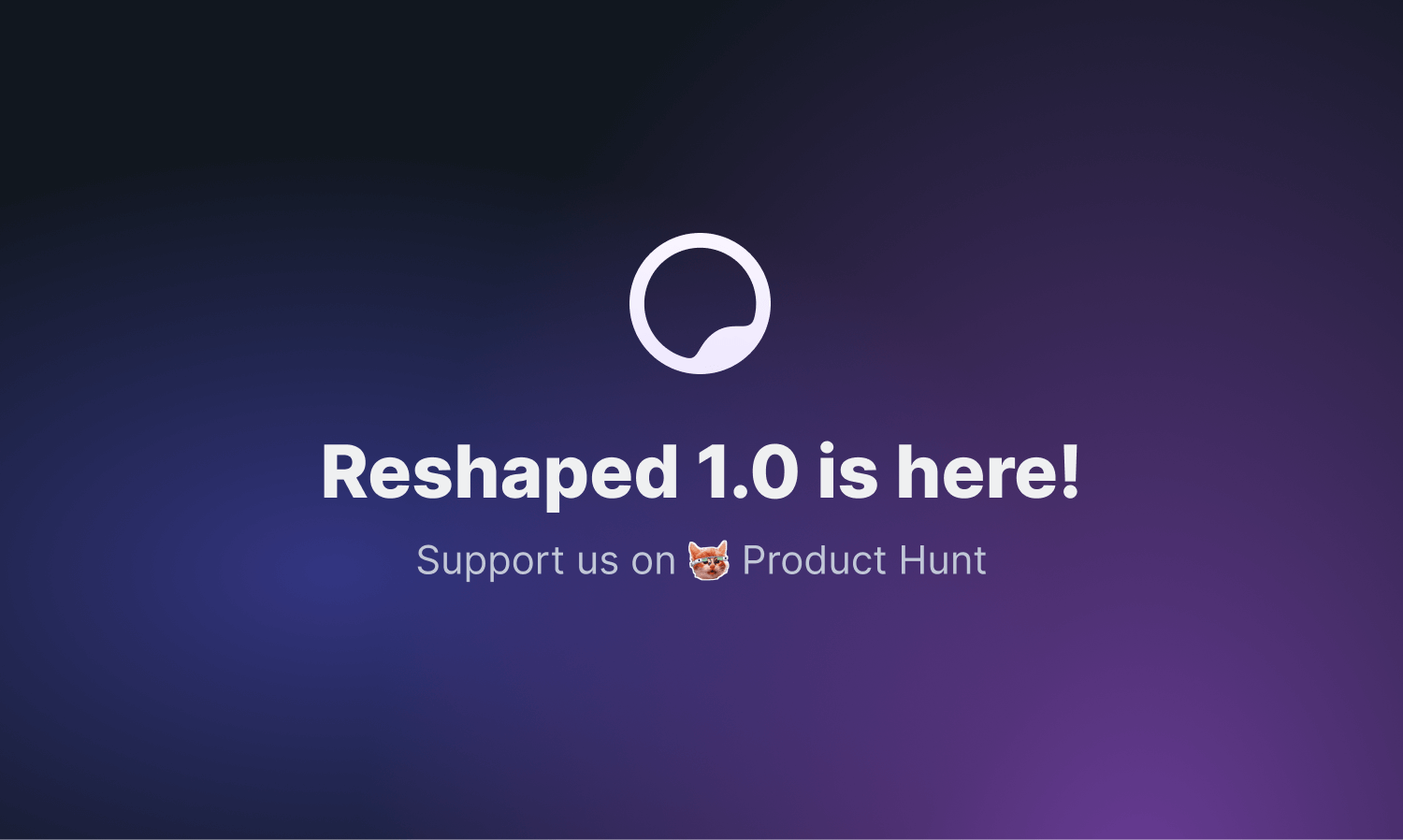
After two years of active development, we've finally reached an important milestone. Today we're releasing the 1.0 version of Reshaped for React and Figma and we're live on Product Hunt.
With this release, we're starting to follow our release strategy with no more breaking changes for the following year. It means that the library has reached a stable state, and you can update to any upcoming minor release in a matter of minutes.
Until June 10, we're keeping early-bird prices to celebrate the release, and we hope you enjoy using Reshaped as much as we do ourselves.
- We have updated our Figma integration documentation, including a new section on how to handle library updates
- Both React and Figma video demos have been updated and made more than 2 times shorter while keeping all relevant content in
- We have added a new FAQ page and revamped the content we had previously
☝️ In case you have custom themes built with Reshaped, don't forget to run the generation script for them to get these new tokens available in your theme.
- Design tokens: Updated backgroundPrimaryFaded value to better align it with other colors in dark mode
- Actionable: Removed native highlight color as a part of Actionable css reset
- Popover: Added scoped theming support for the content rendered inside the portal
- DropdownMenu: Added scoped theming support for the content rendered inside the portal
- Tabs: Added dynamic height support for the selected tab indicator in the pill variant
- Card: Updated bleed property to only support numbers