Core concepts
We follow several common concepts when designing our components. You can apply these concepts when using our components to make your product design scalable. You can also build your own components with the same approach in mind.
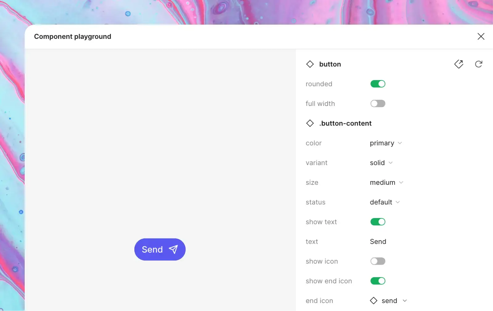
Providing ready-to-use components can be limiting when you have your own product requirements and this often results in detaching the components. Instead, we provide low-level core components that can be grouped to form complex patterns and product features. These components offer slot areas, allowing you to swap them with other components.
We pay additional attention to keeping components aligned across code and design files. Most of the component properties you see in Figma work the same way in React. There are a few exceptions due to Figma's technical limitations or naming best practices.
For example, components that optionally render content in Figma, like icon, require an additional show icon boolean property to control their visibility. This is not required in code so you will only see it in Figma.
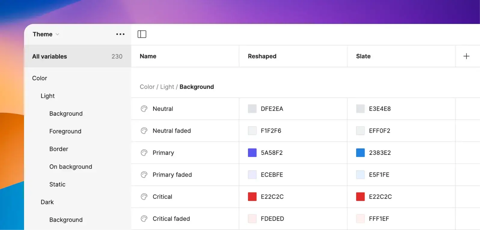
Reshaped uses Figma variables to style all components, supporting up to 4 themes with light and dark modes for team accounts and up to 40 for enterprise accounts based on Figma feature support. This makes it very easy to switch between themes and color modes for our components. If you plan to design custom components, using our design tokens will make your components automatically support theming and dark mode without any additional work or design mockup duplication.