Releases
☝️ In case you have custom themes built with Reshaped, don't forget to run the generation script for them to get these new tokens available in your theme.
<Button color="positive">
  Complete registration
</Button>
We've made a few improvements to our available color tokens to make theming support even more customisation cases:
- Started generating on-background-highlighted color tokens separately from regular on-background ones. This allows you to completely change the background color of a component in the highlighted state while keeping it accessible for users.
- Added new background-positive-highlighted color in order to introduce positive Button variant.
- Updated default tokens with more vibrant default values.
We've gone through the whole library and tested everything for React 18 compatibility. To confirm that it's all working in external environments, we've also migrated this website to React 18.
React 18 was added to our package peer dependencies and you can start your project migration. However, make sure all other dependencies you use are compatible with React 18, there are a few TypeScript changes that a lot of packages are catching up with.
We have updated property tables for all components and utilities to make them more scannable. They also now contain icon indicators for responsive and required properties.
- Button: Added positive variant support
- Checkbox: Removed unused aria-describedby attribute
- Icon: Added attributes.style support
- Icon: Fixed justify-content value for autoWidth icons
- Stack: Added automatic key assignment for the Hidden children
- TextField: Added support for iconPosition to render an icon on the end side of the field
We're adding support for installing Reshaped by access tokens. Since we're not publishing the library on the public NPM, this should help 3rd party tools to easier integrate with our design system and install it as a dependency without manually downloading the system. In the future we might also explore this approach as our default way for installing the library in any codebase.
Meanwhile, if this is something you would like to see working in your tool or you want to be able to install Reshaped in your codebase - send us a message.
- Button: Renamed outlined variant to outline to keep API consistent with Badge
- Updated m viewport values to 661px-900px to simplify responsive design and development
- Updated values for highlighted color tokens in the default Reshaped theme
React:
- Actionable: Removed default :active style
- Button: Updated :active style to scale down on click
- Frame: Automated on-background text colors for primary, constructive and critical Frames to keep the text contrast ratio accessible by default
- Theme: Added className support
- Reshaped provider: Added className support
- Overlay: Fixed absolutely positioned elements z-index inside Overlay conflicting with page elements in Safari
Figma:
- Avatar: Updated an image used in the component by default
- Badge: Updated copy for all variants to “Badge” to keep overrides while switching variants
- Button: Updated copy for all variants to “Button” to keep overrides while switching variants
- Switch: added interactive component support
- Added component library version to the name to help swap libaries
During the past two months we've been working on updating our brand and our brand assets. There are still a few things we're going to roll-out before 1.0 gets released but today we're shipping our renamed library and the new landing page.
We're renaming to Reshaped, which means there are a few things that are renamed in the code:
- Name of the NPM package was changed to reshaped
- Arcade provider is now called Reshaped provider
- Main theme is called reshaped
- CSS variables a new short --rs prefix instead of --arcade
We're changing our theming approach just a bit to make it work with NextJS server-side rendering. Theme definitions now rely on the data-rs-theme attribute which means you can assign it in the _document.jsx file without importing .css files.
<body data-rs-theme="reshaped-light">
- Avatar: Added an alt property and made it render as an img tag instead of using backround
- Button: Fixed rounded border-radius when used with size="large"
- Card: Added responsive syntax support for the padding property
- Container: Replaced size property with width to allow more granular control over its dimensions
- Frame: Added base and elevated background support
- Frame: Added responsive syntax for height and width properties
- Divider: Added automatic aria-orientation support
- DropdownMenu: Updated focus management to return focus back to the trigger element on pressing Tab instead of moving it to the next one
- Loader: Added aria-label and aria-live support
- Progress: Added duration support to make animated progress bars
- Hidden: Added inline property for hidden text elements
- Updated border color token values in dark mode
We've updated framework integrations guidelines and moved them to a separate documentation section on the website. All example projects have been updated with the latest dependencies and their setup has been simplified.
In addition to that, we have added Gatsby starter example and documentation. Check its documentation in the Integrations sections in our docs.
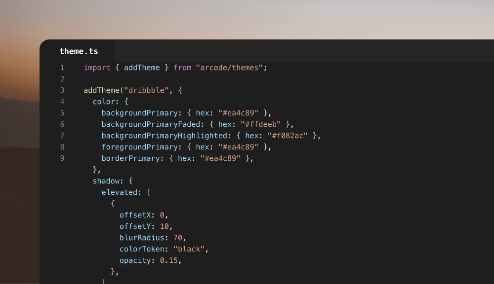
In this release, we've updated the way you can add custom themes. Instead of working with createTheme and createThemeFragment functions, themes are created from an reshaped.config.js file. You can store in the root level of the repository or provide a custom path to our theming CLI.
- Avatar: Added support for dynamic size values which means you can pass any unit token to it
- TextField: Normalized input value suggestion style
This release is the first one to include Reshaped Figma library which is available for both regular and source code licenses. Library consists of 3 files that include:
- Figma components with variants and auto-layout that are aligned with code
- File with design tokens for light mode
- File with design tokens for dark mode
With the help of Figma Themer plugin, you'll be able to design your product just once and switching to dark mode will happen automatically without any manual customisation. This works not only with Reshaped components but also with any custom component you create yourself.
Along with Figma release, we're also updating our pricing tiers.
First of all, even though we're adding Figma library to the list, we're keeping our single seat license to $79 while we're getting closer to v1.0 release of Reshaped. Shortly after the release its price is going to raise to $99.
Team licenses now scale based on the amount of seats you purchase with increasing discounts which means now you get a better deal for 2-3 people teams.
On top of that we're adding two new tiers:
- Source code, for teams building their own design system and who want to use Reshaped as a starting point and skip the whole setup phase. Additionally it could useful for front-end and design teams willing to learn new best practices and dive deeper into the internals of Reshaped for new ideas.
- Enterprise, for companies who need more than just code and design files. We can help you with onboarding to Reshaped, in-house design system workshops, audits or other activities tailored to your needs.
- Frame: Added support for responsive padding property values.
- Frame: Added support for new background color values.
- Hidden: Added visibility flag to work with CSS visibility property instead of display. This is helpful when you want to hide an element visually but keep its space reserved and avoid content jumps.
- Hidden: Aligned responsive syntax with other components. Instead of providing from and to value, you can now use hide property with the regular responsive properties syntax.
- Stack: Added support for multiple Stack.Item using grow in the same Stack.
- Stack: Added support for defining Stack height.
- Text: Added support for line-through decoration.
In this release, we've updated the way we generate output of the theming engine and the way themes are used in the code. We've moved away from theme components and ColorMode utility to a single Theme component that works with both, scoped themes and color modes. This allowed us to avoid additional rerenders of the app when a theme changes and reduced the complexity of theming in general.
import { Reshaped, Theme } from "reshaped";
import reshapedTheme from "reshaped/themes/reshaped.module.css";
import productTheme from "themes/product.module.css";

const Application = () => (
  <Reshaped theme={reshapedTheme}>
    Reshaped theme is used here
    <Theme name={productTheme}>Product theme is used here</Theme>
  </Reshaped>
)
For the cases where using our ESM build output is not possible, we're now additionally providing Reshaped JS and CSS bundles. This will disable regular tree-shaking of the modules but makes it possible to use the library in environments that currently don't support CSS imports from within node_modules. However this shouldn't affect the performance much considering that current library total size is lest than 40kb including both CSS and JS.
To use the bundles, you can import them directly from the package. Note that you will need to import styles just once.
import { Button } from "reshaped";
import "reshaped.css"
- Tabs: Adjusted size to align better with other components
- Tabs: Adjusted focus selector area to better respect tab item content
- Updated border radius values across components
- Updated foundation names and values to align with Figma and improve default theme quality
- Added Theme component and useTheme hook
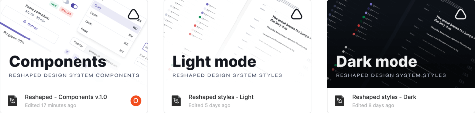
After 3 months of design work we're finalising our Figma library with all the components moving into testing phase. All components are designed with variants, auto-layout and paying incredible attention to handling composition of components the same way you would do that in code. Both React and Figma libraries are perfectly aligned so anything you can design with Reshaped Figma library - you can immediately implement in code with no problems.
<View gap={3} direction="row" align="center">
  <div
    style={{
      background: "var(--rs-color-background-primary)",
      borderRadius: "var(--rs-radius-small)",
      width: 24,
      height: 24,
    }}
  />

  <Text color="neutral-faded">
    --rs-color-background-primary
  </Text>
</View>
We have revamped our design tokens documentation and added visual examples for all Reshaped tokens. Every token type now has a separate page, going through their values and guidelines on how to use them.
- Added Vite starter project to the installation guide
- Overlay: Overlay component was renamed to Overlay utility
- Divider: Added blank property support for easier composition with Tabs
- FormControl: Updated label color for the disabled form fields
- Modal: Merged with Drawer to support position property
- Modal: Added support for custom and responsive padding values
- Modal: Added support for custom width values
- Overlay: Scrim was renamed to Overlay
- Overlay: Added easing to the scrim gradient value
- Popover: Added custom padding support
- Progress: Added small size and white color support
- Select: Added icon support
- Tabs: Merged SegmentedControl with tabs. Tabs support pills-elevated now and all variants can work as a form control
- Text field: Added icon support
<Button color="primary" icon={ActivityIcon}>
  Instant delivery
</Button>
We've made an major update to our documentation layout to let you discover the information you're looking for faster. Some of the highlights are:
- Previews and highlights for all components and utilities
- Navigation to similar components
- Navigation to previous and next articles
- Search to the side menu to filter the components, including filtering by keywords
- Outline of the article highlighting section that are currently on the screen
- Anchor links for specific parts of the article
- Card: Add elevated card support
- Card: Added support for custom bleed values and responsive bleed behaviour
- Container: Added support for custom padding values and responsive padding
- Checkbox: Updated styles for disabled checked state
- Hidden: Update format of the function arguments when used with render props
- Icon: Added dynamic size support. Any unit token multiplier can now be used to define the icon size
- MenuItem: Moved from fullWidth property to roundedCorners to simplify its API
- Radio: Updated styles for disabled checked state
- Switch: Added built-in integration with FormControl utility
During the past two weeks we have been improving the Reshaped onboarding experience for some of the most popular front-end frameworks and bundles. So far we have prepared 4 starter examples for Parcel, Webpack, NextJS and Create React App as well as few demos with more advanced examples.
We have passed 50% of our Figma library progress with 12 components and design token library ready. Everything is already built with theming/dark mode support, using auto-layout and providing variants for every component.
If you want to track the progress, you can do that in our project board.
- Actionable: Improved event handling logic
- Avatar: Fixed icon alignment for auto width icons
- Documentation: Added navigation for previous and next articles
When using colors as variables in CSS, you would usually hit a wall when you want to apply custom opacity values to them. The only way to combine a color variable with opacity is to use it with rgba() color function in CSS.
In order to support this case, we've added auto-generation for rgb values of the background color tokens. They use similar names to background token names with an additional rgb prefix:
var(--rs-color-rgb-background-neutral) /* 223, 226, 234 */
Note that the variable stores only the rgb values themselves but doesn't wrap it with a function. This means you can now use it together with rgba() color function in your css:
background: rgba(var(--rs-color-rgb-background-neutral), 0.5)
- Avatar: Adjusted icon size in larger Avatar size, added faded colors support.
- Button: Updated neutral Button to use inherit Loader color, added white and black colors support for rendering on media content.
- Card: Add custom padding value support.
- Frame: Added maxWidth and maxHeight properties.
- Icon: Added smallest size value, added inherit size support.
- Link: Added critical color, added icon support.
- Select: Aligned Select height with Button height on mobile viewports.
- Stack: Stack.Item split flag migrated to gap="auto".
- Switch: Updated the disabled checked background color to use primary color.
- TextField: Aligned TextField height with Button height on mobile viewports.
On the hompage, we now have a video demo for those who want to take a look of how the development process looks like. In the demo we are building a social media card with some common layouts and interactive behavior that you would usually see in your day-to-day job. Additionally, we show how theming and dark mode work with no extra effort or requirements to write custom styling logic on your side.
While building interfaces we have to implement complex behaviors like modal being opened from a dropdown. Both of these components should trap the focus and return it back to the trigger element when closed. Starting with this release with support chained trap focus. It will return the focus back to the correct trigger even if some of the trigger elements are no longer rendered on the screen.
For example, try going through the whole flow using your keyboard in the following example. Once you close the modal, focus will return to the "Open menu" button.
Hint: Click near the button first and press Tab, to focus on the button using keyboard.
function ChainTrapFocus() {
  const { active, activate, deactivate } = useToggle(false);

  return (
    <>
      <DropdownMenu>
        <DropdownMenu.Trigger>
          {(attributes) => <Button attributes={attributes}>Open menu</Button>}
        </DropdownMenu.Trigger>
        <DropdownMenu.Content>
          <DropdownMenu.Item onClick={activate}>Open modal</DropdownMenu.Item>
          <DropdownMenu.Item>Second menu item</DropdownMenu.Item>
        </DropdownMenu.Content>
      </DropdownMenu>
      <Modal active={active} onClose={deactivate}>
        <View gap={3}>
          <Dismissible onClose={deactivate} closeAriaLabel="Close modal">
            <Modal.Title>Modal title</Modal.Title>
            <Modal.Subtitle>Modal subtitle</Modal.Subtitle>
          </Dismissible>
          Dialogs present a distinct choice to users through their title, content, and actions.
          <Button onClick={deactivate}>Got it</Button>
        </View>
      </Modal>
    </>
  );
}
- Button: Elevated flag support.
- Container: Fixed layout issues when used inside other flexbox elements.
- DropdownMenu: Added custom width support.
- Frame: Added support for separating vertical and horizontal padding values.
- Stack: Stack.Item split flag support to pull an item away from the rest of the items.
- Stack: Added automatic wrap handling for Stack.Item using grow and split with responsive values.
- Overlay: Darkened the background to improve the contrast ratio of the backdrop content with the page.
- useElementId: Fixed id generation for React.StrictMode development mode.
- Reshaped theme: Reduced the line-height of caption1 font token.
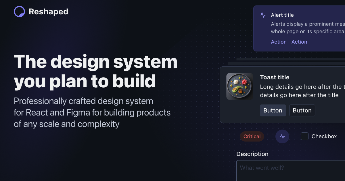
Our homepage has been completely revamped to put emphasize on the newly released features, including our recent theming engine. You can try applying one of the 3 demo themes to our whole website, including their light and dark modes.
- Stack.Item now has gap support. This comes handy when you need a list of elements with different gaps and lets you achieve that without nesting multiple Stacks in each other.
- Stack got improved nested responsive properties support, including bug fixes for the edge cases found that were not supported before.
- Inline and reversed flags got merged into a single direction property for better responsive properties support.
- Vertical stack now automatically take full height of its parent to make controlling its children alignment easier.
- ThemeMode: Renamed to ColorMode.
- ColorMode: Added default foreground color reset for ColorMode scopes instead of using the global text color.
- Hidden: Migrated to from and till properties to provide better support of responsive values.
- Text: Added align property.
- Text: Added text color transition for cases when parent is controlling the color value.
- Card: Added selected flag.
- Reshaped Provider: Improved switching between root-level themes
Stack is the core of any layout you build, and we want it to be as flexible as possible. Starting with 0.9.0 we are using CSS variables to work with responsive styles, and we've started with Stack component integration. Till now, we've only supported a limited number of values that you could use as gap property because its styles have been predefined in CSS. With the new responsive CSS variables, we're changing gap property to support any numerical value as a multiplier of the base unit token.
This change includes both, regular and responsive properties, which means you can pass any number you want for every viewport size:
<View gap={{ s: 2, l: 10 }} />
With this new approach, we're shipping a couple more features for the Stack component:
- Grid is finally merged with Stack. Stack.Item now supports size property while all other properties stay the same.
- Stack now supports responsive wrap property to control flex-wrap manually.
- Stack.Item now supports responsive order property to control the order of items rendering.
We've moved away from supporting RTL during build step with a PostCSS plugin and are using CSS logical properties now instead. This takes us one step closer to moving away from CSS build step and using completely native CSS. Additionally, this update helped us improve a handful components and how they render in RTL mode.
We have added size-limit integration to our merge requests which lets us track all the bundle size changes as one of our main metrics. For example, even after introducing all these new features and responsive styles, we have actually reduced our total bundle size by 2kb down to 41kb.
We're finally releasing out theming engine, including completely typed JS API and CLI to build themes using Reshaped design tokens. Writing your theme definition once will build a React component for you that's ready to be imported into your application. Among other features its main highlights are:
- All theming happens in build time and doesn't affect your runtime performance.
- Dark mode is supported on the design tokens level. No need to write conditionals in your components.
- Scoped theming support which makes it easy to use multiple themes in the same application.
- Theme fragments which define only a part of a theme to save your bundle size
- Added additional viewport boundaries checks for mobile viewports in Popover.
- Fixed Popover with triggerType="hover" affecting how other Popovers on the page work.
For this release we've built our first demo of a page using Reshaped. It's aiming to provide a publicly available example of a project setup as well as giving a hint about how building interfaces with Reshaped looks like.
- Project repository: https://github.com/reshaped/demo
- Deployed project: https://reshaped.github.io/demo/
We've started supporting more scenarios for responsive development. In this release we're adding another viewport support to differentiate between portrait and landscape tablet modes. This means that our viewport media queries names have been updated accordingly:
@media (--rs-viewport-s) @media (--rs-viewport-m) @media (--rs-viewport-l) @media (--rs-viewport-xl)
To make the components easier to use with 4 viewports available, we're also switching from array notation to an object notation for the responsive properties. Since we use mobile-first approach, you don't have to define values for every viewport manually. For example, you can set the Stack gap to be x2 by default and change to x4 starting with large viewport size.
<View gap={{ s: 2, l: 4 }}>
- Tabs: Fixed button animation blinking in iOS Safari
- Popover: Improved keyboard navigation defaults for triggerType="hover"
<View gap={2}>
  <View backgroundColor="neutral-faded" height={10} />

  <View direction="row" gap={2}>
    <View backgroundColor="neutral-faded" height={10} />
    <View.Item grow>
      <View backgroundColor="neutral-faded" height={10} />
    </View.Item>
    <View backgroundColor="neutral-faded" height={10} />
  </View>

  <View direction="row" gap={2}>
    <View width="200px">
      <View backgroundColor="neutral-faded" height={10} />
    </View>
    <View.Item grow>
      <View backgroundColor="neutral-faded" height={10} />
    </View.Item>
  </View>
</View>
We've completely rebuilt our Stack component from ground up to cover a huge number of new edge cases. Most of our focus went into improving nested stacks, edge cases for specific components and reducing the number of elements rendered per every stack:
- Refactored the usage of children removing all unnecessary item wrappers
- Aligned gap property naming with token names.
- Added item grow support to divided stack.
- Improved support for button elements rendered as direct Stack children.
- Added support for nested Stacks with flex-wrap: nowrap.
- Added responsive property support for Stack.Item grow.
- Improved AspectRatio and Card default layout calculations when used in Stack.
We've also tried using the new gap API for flexbox which turned out not so well, due to the limited Safari support and some webkit bugs that have to be fixed first. Once the state of the API becomes more stable, we will immediately migrate to it.
- Actionable: Added custom tag support with as property.
- ActionBar: Added large size support.
- Button: Removed min-width from the text button variant.
- Container: Added size presets for its max-width.
- DropdownMenu: Added small gaps between menu items.
- DropdownMenu: Fixed a bug which sometimes caused dropdown menu stay open after its close was triggerred.
- Frame: Added support for any padding value as a unit design token multiplier.
- Link: Added color and underline properties.
- Switch: Improved keyboard navigation support when used inside Popover and Modal.
- Tabs: Replaced navigation arrows with fade-out for scrolling tabs on mobile.
- Tabs: Improved the navigation arrows toggle throttling.
<Tabs variant="pills">
  <Tabs.List>
    <Tabs.Item id="0">Item 1</Tabs.Item>
    <Tabs.Item id="1">Long item 2</Tabs.Item>
    <Tabs.Item id="2">Very long item 3</Tabs.Item>
  </Tabs.List>
</Tabs>
Tabs get 2 new variants to support new UI scenarios. borderless is helpful when it's used with parent component that provides its own border already. pills variant is used for less prominent secondary navigation.
- Dismissible got min-height defined in case it has no content provided.
- Popover got its keyboard navigation improved when it has no focusable elements in it.
- Modal now supports title and subtitle elements to handle accessibility.
- Overlay now won't close when user tries to close any type of dropdown menu.
<View width="300px" maxWidth="100%" gap={3}>
  <Progress value={25} color="primary" />
  <Progress value={50} color="critical" />
  <Progress value={75} color="positive" />
</View>
We release Progress component to the progress status for a task that takes a long time or consists of several steps. In some cases it can be used for other types of context, like displaying the score values etc.
<View borderRadius="medium" overflow="hidden" width="300px" maxWidth="100%">
  <Overlay
    position="bottom"
    backgroundSlot={
      <View aspectRatio={16 / 9}>
        <img src="/img/examples/architecture-1.webp" alt="Example" />
      </View>
    }
  >
    <Text variant="body-strong-2">Architecture photos</Text>
  </Overlay>
</View>
We're adding Overlay component to let you build nice-looking media cards and display text content on top of them. You can find which position values it supports in the documentation.
- Added HiddenVisually utility to render test applicable only for screen readers.
- Removed Menu component in favor of MenuItem composition with existing layout components like Grid or Stack.
- Added Button text variant that have padding around the text.
- Removed Link icon support since that can be achieved with Button component now.
- Add inherit color support for the TextField to use them on any background.
- Added backgroundColor, borderColor, borderRadius and overflow for the Frame utility.
- Improved focus trap functionality for components like Modal and Popover.
- Added a color property for Icon when you want to override a color coming from the parent element.
- Added an internal Portal utility that helps with managing z-index values of the components.
<Tabs defaultActiveId="1">
  <Tabs.List>
    <Tabs.Item value="0">Components</Tabs.Item>
    <Tabs.Item value="1" icon={ActivityIcon}>
      Utilities
    </Tabs.Item>
    <Tabs.Item value="2">Hooks</Tabs.Item>
  </Tabs.List>

  <Tabs.Panel value="0">
    <View padding={4}>Components tab</View>
  </Tabs.Panel>
  <Tabs.Panel value="1">
    <View padding={4}>Utilities tab</View>
  </Tabs.Panel>
  <Tabs.Panel value="2">
    <View padding={4}>Hooks tab</View>
  </Tabs.Panel>
</Tabs>
We release Tabs component to let you organise navigation between multiple pages or content sections. Its compound components approach lets you easily build custom tab panels or add animation to them, and it's responsive out-of-the-box. Read more about it in its documentation.
<DropdownMenu>
  <DropdownMenu.Trigger>
    {(attributes) => <Button attributes={attributes}>Open</Button>}
  </DropdownMenu.Trigger>
  <DropdownMenu.Content>
    <DropdownMenu.Item>Action 1</DropdownMenu.Item>
    <DropdownMenu.Item>Action 2</DropdownMenu.Item>
  </DropdownMenu.Content>
</DropdownMenu>
We're adding a DropdownMenu component built on top of Popover to simplify the process of building action menus. It works with a similar API as Popover does, however it encapsulates some of its logic, which means you don't have to pass all the right props and aria attributes to Popover manually. Read more about it in its documentation.
- Popover, Tooltip: Improved the usage of accessibility attributes on their trigger and content components
- Popover: Separated trapFocusMode and navigationMode into separate properties
- Menu: Adjusted the gap size between an icon and content in the small Menu.Item
- Actionable: Added a flag to apply the focus ring inside the element boundaries to make it work better with overflow: hidden parents
- Dismissible: Simplified properties API
- AspectRatio: Added default size styles for the img elements used inside it
- Color design tokens: Simplified the usage of color tokens that include state
We have published and documented 6 hooks provided by the library. Together with our utility components they should close the gaps and let you build custom components using the Reshaped context data:
- useElementId to generate ids for DOM elements.
- useFormControl to inherit values from the FormControl utility in your custom-built form fields.
- useRTL to control the direction of the content flow
- useScrollLock to lock and unlock page scrolling.
- useColorMode to switch between light and dark mode of the used theme.
- useToggle for toggling states on and off.
- Frame utility is now exposed from the library
- Badge component received an additional wrapper support for handling Badge position and display
After a year in the making, the first release of the Reshaped is now available for everyone to use. We're starting by releasing v0.1.0 with 31 components, utilities and their documentation. If you're just starting with the library, start with the Overview page from the menu on the left. We hope you enjoy using Reshaped and are already looking forward to get the next release out of the door! 🕹️