Testing design systems in 2025
Over the years, as modern front-end frameworks have gained popularity, our testing approaches and libraries have also become more standardized. When evaluating testing libraries—especially for design systems or component libraries—we need to go beyond surface-level checks and focus on thoroughly testing the implementation of individual components.
Usually the common approaches for testing design systems on the web include the following:
- Manual testing and a general development environment come first since, when building a library, you need components to be isolated. Storybook is an obvious choice here, as it's widely used by most teams for building and showcasing UI components.
- Unit testing is the most common automated testing approach and the easiest to start with, focusing on atomic pieces like individual components or utilities. Typically, it's done using a combination of jest or vitest with testing-library. Since both run in Node.js, they rely on jsdom to mock browser APIs. However, this means certain aspects—such as element sizes, position calculations, and media query updates — can't be fully tested, requiring manual testing for those cases.
- Snapshot testing complements unit testing by capturing a snapshot of the output and comparing it against future test runs. While it can be useful for library utilities, it's one of the most incorrectly used testing methods. I've seen many engineers write snapshot tests either as a quick way to boost code coverage or under the assumption that verifying all class names in a snapshot guarantees correct rendering. Despite its drawbacks, snapshot testing can still be valuable in certain cases and is built into jest and vitest by default.
- Screenshot testing is a significant upgrade from snapshot testing, as it allows you to verify how a component actually looks when rendered in a browser. It works by comparing newly generated screenshots to previous ones, helping detect any unexpected visual changes. If you're using Storybook, Chromatic is an excellent tool for automating screenshots of all your stories and providing a UI for reviewing differences. Alternatively, it's common to use playwright or cypress component testing modes with screenshot plugins if you want to handle this testing phase in-house.
- Compared to product testing, end-to-end testing is rarely needed for design systems unless you maintain an internal test environment with predefined static product flows. Common tools for E2E testing include playwright and cypress, but since this is more of an edge case for design systems, I won't be covering it further.
This setup is solid, but it has some weak points—mainly the limitations of jsdom and the need to maintain multiple environments for testing similar component functionality. For example, if you have a Button with a disabled state, you would need to test it visually in Storybook and then write a separate unit test for the same state.
This situation was frustrating for me because of the amount of duplicate code I had to write and the added complexity of managing multiple testing environments. What I really wanted was a way to write component tests once and have them cover everything—without needing separate setups for different types of tests.
I started by trying out the Vitest experimental browser mode instead of Jest. While still in development, it proved to be quite stable in practice. Since it renders components in a headless browser, it provides direct access to real browser APIs, eliminating the need for mocking. Performance-wise, it's slightly slower but still comparable to running a Jest test suite—making it a worthwhile trade-off given the reduced need for mocks. It also includes a built-in debugging interface, which is a nice bonus. However, it still introduces another environment for rendering components, adding some complexity.
Since I was already using Storybook with Chromatic, I wanted a similar approach where I could run my unit tests within the same environment. Storybook has made significant investments in testing over the past few years, so it felt like perfect timing when I discovered their early access release of @storybook/experimental-addon-test. This package seamlessly integrates with Vitest and provides additional controls for running tests directly in the browser.
While both Vitest browser mode and the Storybook addon are still experimental, I decided to explore what migrating to them would look like. As a library author, I have full control over when to upgrade dependencies, allowing me to adapt to any API changes as they evolve even when packages are still experimental.
My ultimate goal after testing was to see if I can completely drop jest and react-testing-library dependencies. Storybook already provides sufficient Vitest bindings and integrations with other packages, allowing me to mock handlers, trigger user events, and handle async operations — all within the same environment.
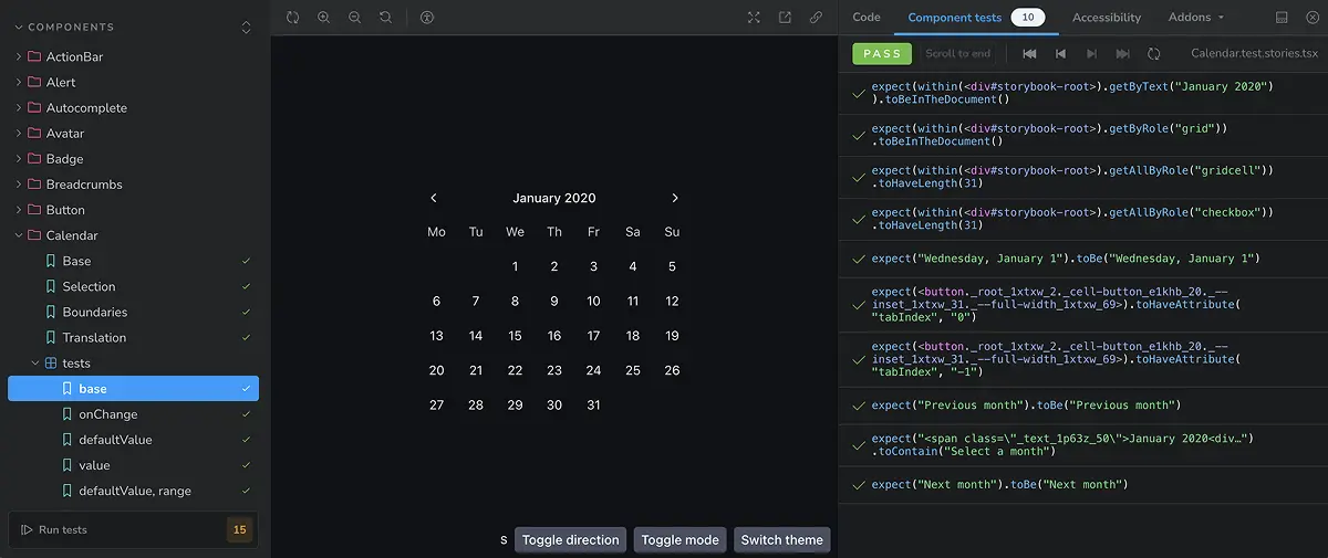
After experimenting with multiple approaches to writing and structuring tests, I successfully migrated ~70 components to rely entirely on Storybook for testing.
With the Storybook — Vitest integration and turning stories into a complete test suite, there are a few additional benefits we're getting:
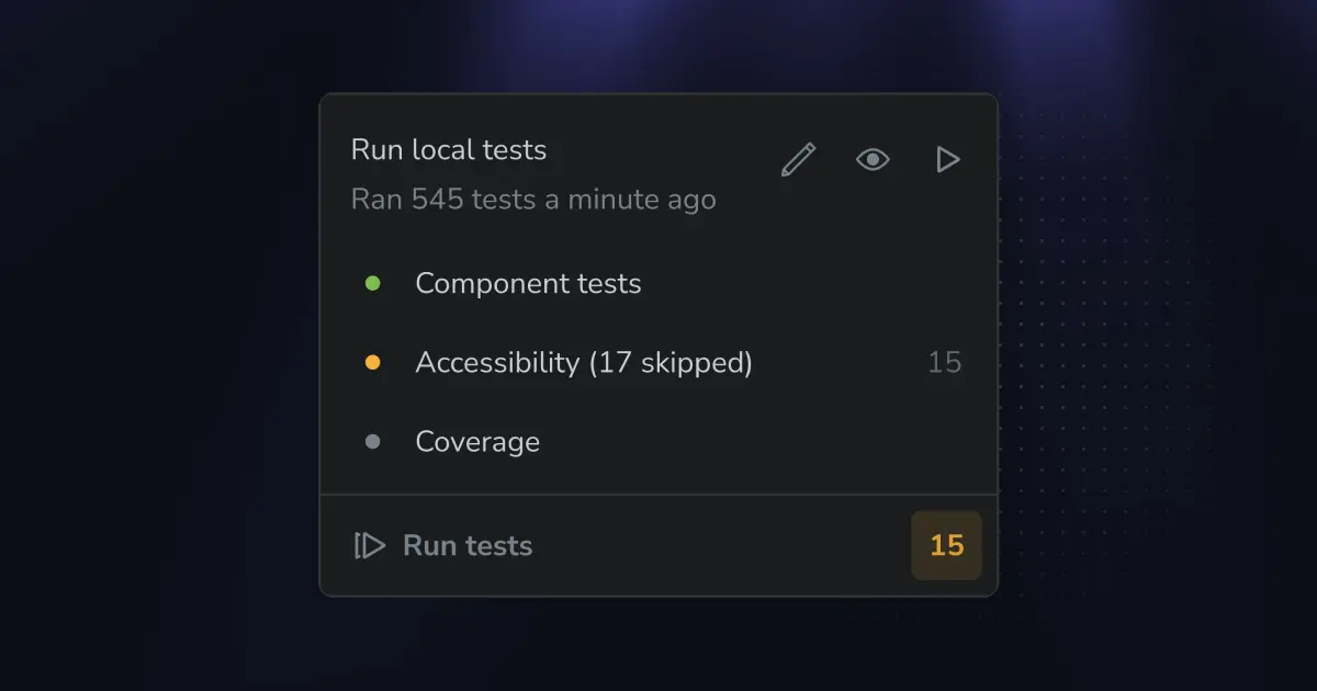
- The Storybook accessibility plugin is automatically integrated with the testing module. If you enable accessibility tests, you can easily evaluate all your components in the browser environment, including checking for color contrast issues—all within a single place.
- The testing module also includes test coverage integration. Since all tests now run in the same environment, it's much easier to get accurate insights into what's missing and avoid duplicated tests.
- All stories you write are automatically passed to Vitest and will run in your CI. If you have unit tests for pure JavaScript utilities, you can still use Vitest for those, keeping everything within the same testing pipeline. For example, I use this approach to test theming utilities.
My initial idea was to have two Storybook files for each component—one for stories requiring visual testing in Chromatic and another dedicated to behavior testing. This approach seemed beneficial for controlling the number of screenshots taken while also maintaining a structure similar to traditional unit tests.
At the same time, this approach felt like over-optimization at the cost of developer experience. So, I decided it was fine to take more screenshots and store everything in a single file. By naming the stories to reflect the props they're testing, I could ensure full coverage of props and edge cases while keeping the setup simple. Additionally, maintaining a single file made it easier to manage tests without having to constantly decide where each test should go.
// Button.stories.tsx

// Using the name field in my stories to mention multiple props
// and keep correct casing for them

export const variants = { name: 'variant', ... };
export const disabled = { name: 'disabled', ... };
export const attributes = { name: 'className, attributes', ... }
One key difference from writing unit tests in Jest or Vitest is that, since you're working in the browser, you don't immediately see what the test is doing unless you look at the code. Just like I previously used a custom example wrapper for screenshot tests, I found it equally useful for these new test cases—especially when displaying multiple examples within the same story. This made tests more visual and easier to understand at a glance.
With all the changes applied, let's take a look at how before and after state for a simplified set of Button component tests would look like. We'll test the button disabled state for its variants. In the original setup it would be spread across multiple tools:
// Button.stories.tsx
import Button from "components/Button";

export default {
  title: "Components/Button",
  component: Button,
};

export const disabled = () => (
  <Example>
    <Example.Item title="variant: solid, disabled">
      <Button disabled>Label</Button>
    </Example.Item>
    <Example.Item title="variant: outline, disabled">
      <Button disabled variant="outline">
        Label
      </Button>
    </Example.Item>
  </Example>
);

// Button.test.tsx
import { render } from "@testing-library/react";
import userEvent from "@testing-library/user-event";

describe("Components/Button", () => {
  test("disables the button", async () => {
    const handleClick = jest.fn();
    render(
      <Button disabled onClick={handleClick}>
        Label
      </Button>,
    );

    const button = screen.getByRole("button");

    await userEvent.click(button);

    expect(button).toBeDisabled();
    expect(handleClick).not.toHaveBeenCalled();
  });
})
After the migration, this has changed to be a single test, even though the Storybook part became slightly more verbose:
// Button.stories.tsx
import { StoryObj } from "@storybook/react";
import { expect, userEvent, fn, Mock } from "@storybook/test";
import Button from "components/Button";

export default {
	title: "Components/Button",
	component: Button,
};

export const disabled: StoryObj<{ handleClick: Mock }> = {
	name: 'disabled',
	args: {
		handleClick: fn(),
	},
	render: (args) => (
		<Example>
			<Example.Item title="variant: solid, disabled">
				<Button disabled onClick={args.handleClick}>Label</Button>
			</Example.Item>
			<Example.Item title="variant: outline, disabled">
				<Button disabled variant="outline">Label</Button>
			</Example.Item>
		</Example>
	),
	play: async ({ canvas, args }) => {
		const button = canvas.getAllByRole("button")[0];

    await userEvent.click(button);

    expect(button).toBeDisabled();
    expect(handleClick).not.toHaveBeenCalled();
	}
}
This single file will render a story in the browser and run the interactive behavior on mount for the first button as well as check the overall accessibility of the story. It will be picked up by Chromatic and you'll see the labels coming from Example.Item on the screenshots to know what is the expected result for each example. And the same story will be picked up by the Vitest when running your tests in CI 🔥
While migrating all components to the new setup, there were a few things I had to figure out:
- Writing stories, especially when mocking event handlers, is more verbose compared to unit tests. I don't expect this to change much, as Storybook includes many features tied to this syntax. However, over time, you get used to it, and the added flexibility makes it a worthwhile trade-off.
- I had to deal with some unstable test execution since tests were running across three different environments. Over time, some of the flaky tests revealed actual issues, while others required workarounds. I expect this to become more stable by the time the test addon moves out of experimental mode.
- I originally underestimated how much time it would take to migrate from jsdom to a real browser environment. Even though the test syntax is nearly identical, I still had to update imports and story definitions. Additionally, testing with real browser APIs immediately surfaced more areas for improvement that weren't as obvious before. While this is probably outside Storybook's direct scope, it feels like if their team provided codemods for migrating from jest or Vitest to Storybook stories, more developers would consider making the switch in the future.
- Finally, writing all tests in Storybook felt very different from traditional unit testing. It took me three or four attempts to figure out the best way to structure everything — defining naming conventions, organizing stories, and ensuring a smooth developer experience for writing and maintaining tests.
I've chatted with the team behind Chromatic and Storybook, and they mentioned that challenges around structuring stories aren't unique to my setup. There's already an open RFC aimed at improving the developer experience when combining visual stories with unit tests, which is promising for the future.
Nevertheless I'm quite happy with how it turned out even though I wasn't sure about this approach at first. If you want to check how it all looks in practice, it's now available with the latest Reshaped release at reshaped.so/storybook. Note that testing module is only rendered when running Storybook locally and you will see a mix of multiple approaches, while I'm moving components to the final single-file approach described in the article.
I would also like to give a shout-out to:
- Stefano Magni for helping out with article pre-read
- Michael Shilman and Kyle Gach for providing migration support and article content feedback
Everything written here is based on my own experience and is not affiliated with the tools mentioned. In case you're also a design system enthusiast and have more ideas on how to improve testing setup — drop me a message.