Reshaped is now open source

The design system you plan to build

Professionally crafted React & Figma components for building beautiful products or starting your own design system

npm install reshaped
Check documentation
EN
Esther Naomi
New
Artwork preview
Artwork preview
Artwork preview
5 hours left
Discount
Find all components in the documentation
We were in the middle of transitioning from a mix of different software stacks to a more streamlined setup, so finding a tool that could keep our frontend looking sharp and performing well was high on the list. Reshaped quickly stood out for its atomic component approach and has been a great fit. What truly made us commit to Reshaped was the team behind it: they actively support the product, genuinely care about user feedback, and keep the door open for new ideas. It's rare to find that kind of dedication, and it made the choice an easy one.
Read the case study
Our engineers and designers compared multiple options and settled on Reshaped because it has the best Figma library (a 100% match with its React counterpart), a wide range of well-designed components, doesn't use CSS-in-JS or other heavy dependencies, works perfectly with server-side rendering, and is easy to integrate with frameworks like Next.js and Vite. We’ve never regretted the decision to use Reshaped. The library dramatically boosted our development speed, enabling us to release our MVP faster than planned.
Read the case study

Everything you expect
from a design system

<Card padding={0}>
  <View padding={2} gap={3} direction="row" align="center">
    <Image
      width={12} height={12} borderRadius="medium"
      src="/img/examples/avatar-food.webp"
    />
    <View.Item grow>
      <Text variant="body-3" weight="bold">Food</Text>
      <Text variant="caption-1" weight="medium">247 results</Text>
    </View.Item>
    <Button rounded variant="ghost" icon={IconHeart} />
  </View>
  <View backgroundColor="neutral-faded" paddingInline={2} paddingBlock={1}>
    <Text variant="caption-2">Sponsored</Text>
  </View>
</Card>
Food
247 results
Sponsored
Sync theme from code
Select a `theme.json` filed generated by Reshaped in your code repository.
Upload
Theme name will be used as a Figma variables mode
Reshaped is the gold standard of "just enough design system", where they have figured out the minimal viable token architecture and an infinitely flexible base component kit. I constantly look to them for inspiration.
Luis Ouriach
Designer Advocate, Figma
When we are working on new features, I enjoy checking out how Reshaped approached the solution to that problem. It helps in my search for the best possible approaches.
Olivier Tassinari
Co-founder and CEO, MUI

Instantly get up to speed with the features you could find in the most advanced design systems in the industry.

Reshaped is using React as the only runtime dependency. It doesn’t require you to install any css-in-js library to start using it.

You don’t have to design or write your styles twice anymore. Reshaped semantic tokens automatically apply themes and color modes even for the custom components you build.

neutral-300
neutral-700
background-neutral

Stop fighting with media queries. Adjust your styles based on the viewport size without writing custom styles with out responsive syntax.

Daniel Frost
Daniel is a design system specialist who creates cohesive and scalable design solutions.
Subscribe

All components are WCAG and WAI-ARIA compliant. From color contrast to screen reader navigation – your product will be much easier to use for everyone.

Actions

Our codebase is written in TypeScript and all component properties are fully typed. When using Reshaped, you automatically get code autocompletion and error validation right in your editor.

React setup
Core principles
Release strategy
Server-side rendering
RTL
Source code
Theming plugin
Figma setup
Tokens studio
Framework integrations
TypeScript
External packages
Design tokens
Properties
Accessibility
Creating themes
Scoped theming
Hooks

Learn the best practices of each tiny bit of the system with our documentation. We packed it with many contextual tips, interactive playgrounds, and component examples.

With our theming CLI you can easily create new themes, add more design tokens and export the data to other design token tools.

Single-line configuration to access all Reshaped design tokens in Tailwind classnames.

We ship code and design libraries together. Everything in Figma library is available in code with the same properties and is built using the latest features, like Figma Variables.
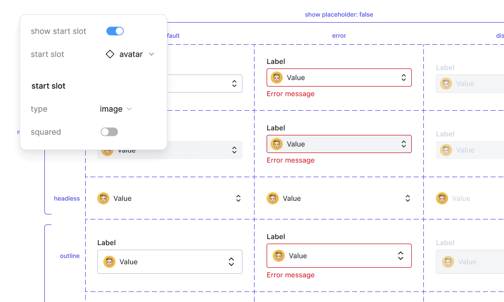
Library preview
I love how Reshaped focuses on the “system” aspect of design systems, offering an excellent set of core components with the latest Figma features. It’s a great starting point for building products or creating your own design system.
Jordan Hughes
Product Designer, Creator of Untitled UI
Reshaped's superpower is its theming architecture because it has a fine balance of flexibility and constraints. It is easy for the consumers to tweak the theme based on their brand and product and yet it is logical enough to understand from the outside and provides automatic dark mode support.
Kamlesh Chandnani
Principal Frontend Engineer, Razorpay
Professionally crafted React & Figma components for building beautiful products or starting your own design system
Built with Reshaped in Amsterdam ❤️
Contact us·
© Reshaped 2025